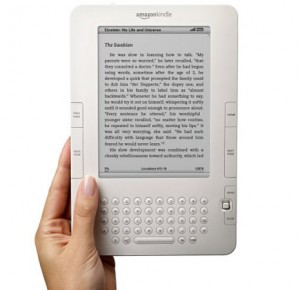
 Usability guru Jackob Nielson has given Amazon’s Kindle eBook reader the once over. His conclusion: perhaps unsurprisingly, the device is great for linear reading – think books, and in particular novels – but falls down badly when consuming non-linear content, such as electronic versions of magazines or newspapers.
Additionally, Nielson says that although he has previously questioned the viability of eBook reading devices in general, the Kindle’s e-ink screen technology and his own reading speed using Amazon’s device (less than 0.5% difference compared to the exact same paperback) has changed his mind.
On the Kindle’s linear reading strengths, Nielson gives praise to the device’s dedicated page turn controls:
… turning the page is extremely easy and convenient. This one command has two buttons (on either side of the device). Paging backwards is a less common action, but it’s also nicely supported with a separate, smaller button.
The device thus offers good support for the task of linear reading — appropriately so, as Kindle’s design is centered on this one use case. While reading, your only interaction is to repeatedly press the next-page button.
However, “anything else is awkward”, writes Nielson.
See also: What Kindle on iPhone says about Amazon’s eBook strategy
In particular he criticizes the Kindles smartphone-esque 5-way controller. “Repeatedly flicking the 5-way to move the cursor around the screen is extremely tedious. It doesn’t feel like direct manipulation at all. The 5-way owns the cursor, not you, and getting the cursor where you want it requires a lot of work.”
Overall, the User Interface, outside of consuming linear content, is poorly thought through. The reason, says Nielson, is that the Kindle’s design is dominated by the book metaphor.
So, the design decisions that make Kindle good for reading novels (and linear non-fiction) make it a bad device for reading non-linear content. Sure, Amazon designers could fix simple UI stupidities, such as the interaction design for a newspaper ToC. But doing so would simply apply a band-aid. To truly optimize the non-linear user experience, they’d have to completely reconceptualize the Kindle design.
Ouch.

He is really spot on here as I don’t own but I do belive thank ebooks will take over in work first rather than home use as with a novel you kind of like holding the book but with workyou just want to understand or get the content and that’s it you not interested in the paper or whatever you bookworms geek out about
but I do think that enovels will come but now I think they should focus on getting the enterprise side down and then people will get into novel reading on a kindle.
I have to disagree. I’ve owned a Kindle since December 2007, and I love the experience of reading the New York Times on it. The design is that you start at the beginning of the articles list (Front Page section), which lists the headline and capsule of each article. You can click on a headline to go to the full article, and full articles all start with links to skip to the next article, to the sections list, or to the articles list for the current section. When you’re done with an article, you can use the BACK button (not prev. page) to go back to the capsule where you linked from, or you can keep scrolling through the full articles.
This may not be the perfect interface, but it sure beats the physical newspaper hands down! (And I love to be able to look up the “big words” when I don’t know them. I’m smart, but I didn’t know the word lacuna, nor do I think it is a better word to use than gap!)